Quantcast
Channel: http://blog.foundfolios.com/
Viewing all 188 articles
Browse latest View live

John Fulton’s Stripped Down Photo Shoot  When John Fulton’s...

$
0
0


John Fulton’s Stripped Down Photo Shoot

 When John Fulton’s client Energy Logic first heard the pitch for a new ad campaign, they were understandably taken aback.  After all, running ads featuring portly men in speedos isn’t a very traditional marketing tactic.  After some coaxing by the ad agency, however, the alternative energy source manufacturer assented to roll the dice.  Hiring photographer John Fulton to do the shoot ensured that the campaign would be expertly executed, and extraordinarily well received.

The concept behind the ads was that Energy Logic’s heating equipment was so efficient that working in a garage is “almost like working at the beach,” according to the campaign tagline.  As John recalled “I think what convinced the client to go along with the agency’s concept was that no one else in their industry was thinking outside the box or doing anything very creative.” 

Understandably, John’s team had to go through several different casting agencies and sources to find models who were willing to pose in “banana hammocks” for a national campaign.  “Once we found these guys, we knew we had the right people,” said John.  “They were so comfortable around the crew, maybe even a little too comfortable!  They didn’t even change out of the speedos during the downtime between shots.  It was really important that we found talent that was not only comfortable, but willing to have a good time with it, and we certainly cast some characters.” 

The shoot was done on location in Nashville, TN over the course of just one day.  The models were all very easy to work with and John’s excellent location scout found the perfect shooting locales for the advertisements.  In the end, Energy Logic was very happy with the unorthodox, but eye catching, photos which John produced.

To see more of John’s conceptual advertising, visit his FoundFolios portfolio.


Heather McGrath’s Moving Sculpture Wanting to photograph...

$
0
0


Heather McGrath’s Moving Sculpture

Wanting to photograph something truly unique, Massachusetts-based photographer Heather McGrath got together with her friend Silas Finch, a sculptor out of New Haven, to create a very non-traditional art piece. 

Although clothing as art is not a new concept, Silas pitched the idea of using an enormous World War II era parachute as a sort of moveable sculpture.  Heather’s photographic eye immediately knew that this was the art piece she had been looking to shoot.  “I love putting beauty in nature,” says Heather, “so I was immediately excited when I heard Silas’ idea!”

The shoot took place on a treacherous, weather-beaten cliffside just north of Boston where Heather is based.  Having shot at this location before, Heather knew that the backdrop would lend the exact dramatic feel that she wanted to convey with these photographs. 

Recruiting stylist Jojo Goto to make sure the dress and model looked perfect, and Manda Carco of Anchor Artists to do hair and makeup, Heather and her small team got to work.  The conditions were dangerous, and Silas risked life and limb to “sculpt” the dress between shots in order to maintain the artful, flowing look.  “Silas even had to carry the model down from the rocks at one point because she couldn’t walk in the dress,” Heather recalled.

Although it may seem like the photos are highly produced, the whole shoot was very organic, utilizing only natural lighting and wind.  At the end of three hours Heather was happy with what she had captured, and she wrapped the shoot before the sharp and craggy rocks could claim a victim.

The photographs turned out beautifully, and were on display in a well-received exhibition along with the dress last summer in Boston.  Excited to take their concept to the next level, Heather and Silas are already brainstorming their next artful collaboration.

For more of Heather’s beautiful work, visit her FoundFolios portfolio.

In Between Dreams with Rocio Segura The dream-obsessed Rocio...

$
0
0


In Between Dreams with Rocio Segura

The dream-obsessed Rocio Segura has always used art as a way to express her subconscious thoughts.  Although primarily focusing on fashion and beauty photography these days, Rocio turns back to her fine art background whenever she needs an outlet.  “It’s like therapy for me,” says Rocio.  She is particularly proud of one fine art project she did a few years ago as her final thesis for her Master of Professional Studies Degree in Digital Photography from the School of Visual Arts in New York City.

The Spain native was looking for a way to explore the concept of dreaming, an idea that has possessed her since she was a child.  “When we dream, our minds are free to do all the things we would never do in real life,” waxed Rocio poetically. “The human brain creates a state of being in which our hidden fears and desires come to the surface.”  Using this basic idea as a launchpad, Rocio planned out a photo project that would wordlessly define this intangible dream state. 

“The idea was that I would create an image featuring two versions of a person,” Rocio explained. “One showing the exterior they present to the world, and the other an interior, more secret self.”

Recruiting subjects from the small SVA modeling agency, Rocio spent three hours with each subject, coaxing them to reveal their inner fears and deepest desires and express these through poses and facial expressions.  In the end, Rocio had about 700 photos from each session to parse through.  “In the end, the project contained just 12 images, so the editing process was definitely difficult,” Rocio said.  The final composite pieces were very well received and Rocio was applauded for her original concept and near flawless execution.

For more of Rocio’s fashion beauty, and portraiture work, visit her FoundFolios portfolio.

Heath Robbins Brews Up a Holiday Catalog for Keurig Boston-based...

$
0
0


Heath Robbins Brews Up a Holiday Catalog for Keurig

Boston-based food and lifestyle photographer Heath Robbins was recently tapped to shoot all of the lifestyle imagery for the 2013 Keurig Winter and Holiday Gift Guides.  He had previously worked with Keurig’s ad agency (King Fish Media), so they knew he would be a professional and reliable choice for the gig.

Knowing he had only one day to do the entire shoot, Heath and his team got an early start.  After all – they needed to empty an entire house and put everything back after the shoot was over!  While some of his team worked to clear the scene, Heath planned out his shots and spoke with his models about what they should be emoting while drinking fresh brewed coffee from a Keurig machine.

Heath also personally oversaw the lighting of the shots, as he wanted to ensure that everything felt natural and organic.  Because the shoot was being done on the second floor, his lighting technician had to climb a ladder and position strobes so that they beamed through a window onto the scene.  

“Having such a great team really made this a smooth process,” Heath said.  Every minor detail was addressed, from what type of mugs looked best on camera, to what color his food stylist, Jessica Weatherhead, should make the coffee inside of the mugs (cream or no cream?).  At the end of twelve hours of prep, shooting, and breakdown, Heath and his tired crew had the shots they needed.

The photographs were run in Keurig’s annual direct mail gift guide.  King Fish Media (and their client Keurig) were thrilled with the lifestyle elements that Heath was able to bring to the campaign.

Check out the behind-the-scenes video Heath produced of the shoot:
https://vimeo.com/84686149.

For more of Heath’s fantastic work, visit his FoundFolios portfolio.

Freddy Fabris’ Modern Masterpieces Sometimes in life, fate...

$
0
0


Freddy Fabris’ Modern Masterpieces

Sometimes in life, fate arrives to give you a little push in the right direction.  This was the case with photographer Freddy Fabris.  Since his early days in photography, Freddy had been looking for a way to pay homage to the works of classic painters like DaVinci and Rembrandt.  Then, one day, Freddy stumbled upon an old car garage. “It was filled with this richness of textures and objects that immediately started to inspire me.”  Freddy knew that he had found his location, and immediately began to plan his dream shoot.

Having a background in painting certainly helped Freddy develop the look for his modern take on classic works of art.  “My biggest challenge was to find a way of telling these stories, these classic situations, from a different angle.  To take them totally out of context, yet maintaining the essence, the overall feeling of the original.  To keep them humorous, yet craft them with a very profound sense of lighting, textures and finish,” recalled Freddy.

After completely fleshing out his vision for what he wanted to create, Freddy put his team together: Angela Finney as set/prop stylist, Agga B as wardrobe stylist, and Morgan Blau on hair and makeup. Everyone he gatheredloved the idea, and was excited to be a part of the project.

With the team assembled, Freddy set about looking for models for the shoot.  “Casting was a delicate issue,” Freddy said, “I wanted people who looked both timeless and renaissance-like, yet believable in their modern Midwestern mechanic roles.”  After two weeks of searching, Freddy landed the perfect models through Real Talent and Planet Earth.

Due to careful, meticulous planning, the day of the shoot went off without a hitch.  “Everything fell into place beautifully,” Freddy said. “The team was on point on every detail, and it was a wonderful teamwork experience.”

After the final selection, Diego Speroni brought the images to the next level through his masterful retouching work to make the pictures truly resemble the classic oil painting which inspired them. 

To see the images and more of Freddy’s work, visit his FoundFolios portfolio.

Cade Martin Floors It After noticing the impressive, fanciful...

$
0
0


Cade Martin Floors It

After noticing the impressive, fanciful style that photographer Cade Martin employed in his recent shoot for Starbucks, Shaw Floors knew they had found the right person to refresh their brand image.  After tracking Cade down, the photographer and the company worked together to conceive a fresher, more whimsical take on product shoots, rather than the traditional interior shots of previous campaigns.  Cade, not surprisingly, delivered.

Finding the right location was critical to the success of the campaign.  Cade wanted something mystical, something unexpected.  He was also looking for a location that would contrast with the polished look of hardwood flooring that Shaw was promoting.  Finally, Cade found his location in Barnsley Gardens, a striking gothic-style castle in Georgia that juxtaposes gorgeous gardens with beautiful buildings in disrepair.

Cade decided to highlight the disparate landscape for his shoot, replacing manicured lawns with plush carpeting, cracked stone with beautiful hardwood floors, and aged cement with stunning rugs.  The venue added an otherworldly dimension to the piece that was unforeseen and impactful.

We really wanted to rethink how [people] look at floors,” commented Cade.  “We wanted to create a mood, create an atmosphere. It’s the twist—seeing the flooring where you don’t expect to—that makes you look again.”  Living up to his previous work, the only thing you can expect from Cade Martin’s photography is the unexpected.

To see more of Cade’s fanciful, imaginative work, visit his FoundFolios portfolio.

Philip Harvey Leaves an Impression Philip Harvey was fortunate...

$
0
0


Philip Harvey Leaves an Impression

Philip Harvey was fortunate enough to be contacted by ad agency DDB Worldwide (through his agent Alyssa Pizer) to do a one-of a- kind shoot for Clorox.  The goal was to showcase the cleaning power of Clorox’s flagship stain remover.  

“The client knew what they wanted and had great layouts to work from, but they weren’t quite sure the best way to accomplish the concept photographically.  That’s where I came in,” Philip said.  

Philip and his team spent a fair amount of time analyzing the best approach to the shoot.  At first, Philip thought about the project in several different ways, but in the end what made the most sense was photographing the fabric without the stain first, and then slowly adding the stain with an eyedropper and then photographing the stain. The retoucher could then use that image overlaid with the unstained fabric to “paint in” the written words over the stain.  The stylist pre-tested “a mélange of different types of stains, and colors of fabric” so the client could walk into the studio and select the best combination to fit the concept the art director envisioned.

This method allowed Philip a lot more flexibility with the fabric.  “In my early testing before the shoot it was a pain trying to get the material to retain its shape after the liquid was applied – the fabric kept moving and reshaping on us.”  The stylist was able to delicately apply the stain with an eyedropper and Philip was free to focus on other important aspects of the shoot such as achieving the perfect lighting.

The end result came out fabulous and the “faked out” image was entirely convincing!   DDB and their client Clorox were ecstatic with the final images, and Philip hopes to be tapped again for more projects in the future!

To see more of Philips impressive imagery, visit his FoundFolios portfolio.

Scott Council’s Olympian Feat A few years back, Scott Council...

$
0
0


Scott Council’s Olympian Feat

A few years back, Scott Council was contacted by ad agency Young and Rubicon with an incredible, once in a lifetime job opportunity: photograph the US Olympians participating in the 2012 Summer Olympics in London.  Honored to be pitched such a prestigious gig, Scott readily accepted.  The shoot went so well received that Scott was invited once again to photograph the US Olympic team headed to Sochi Russia for the 2014 Winter Games.

Scott rounded up his team and got to work creating the set at Smashbox Studios in Hollywood.  Drawing inspiration from the film Rocky IV (where Rocky fights in the Soviet Union), Scott filled the set with antiqued furniture, vintage ski equipment, and custom-illustrated Olympic posters from Soviet era Russia.  “We really wanted to capture the emotion and nostalgia of the Games,” recalled Scott. “We were going for something dark, strong, and stoic to mirror the strength of the athletes.  This was no lifestyle shoot.”

One of the biggest hurdles (or in the case of the Winter Olympics, moguls) of the shoot was having the time to shoot each athlete.  Working within a very limited 20 minute window per athlete, Scott still managed to convey to the subject the type of portrait he wanted.  “Normally I have more time to get to know the subject, make them feel comfortable.”  For this gig, due to the hectic nature of the athletes’ schedules, time was not his ally.  Despite this, Scott remained level headed and mellow as always and managed to get every shot he needed.

Getting the perfect shot was important to Scott, as this was more than just a gig for him.  The honor and responsibility that came with this job in particular weighed heavily on him during the course of the shoot.  “To me, this was one of the most important shoots I’ve ever done.  All of the advertising money from these images goes to the athletes to make it possible for them to participate in the Games, which is critical in my opinion.  The Olympics are a physical representation of our interconnected world.  To be able to contribute to that is otherworldly.”

Visit the Team USA site over here.

To see more of Scott’s gold medal caliber photography, visit his FoundFolios Portfolio.


Joanne Hus Draws Up a Play After seeing the stellar images...

$
0
0


Joanne Hus Draws Up a Play

After seeing the stellar images on Joanne Hus’ FoundFolios portfolio, the managing editor of SportsBusiness Journal, Ross Nethery, knew that she was the illustrator he was looking for to create the cover of his magazine’s twentieth anniversary issue.  A quick phone call later and Joanne happily accepted the job.

Joanne briefly discussed with Ross what the cover image should convey, and then got to work sketching up a concept.  Her initial thought was to use sports stadiums shaped as the number “20” as the centerpiece of the illustration.  After sending a draft back to Ross, they both agreed that there should be a more modern twist on the piece to convey the passing and changing of time from when the magazine first launched in 1994 to present day.  This gave her the idea of using a smartphone in the image because “streaming video on a device would not have been possible even just a few years ago.”

Needless to say, Ross loved the smartphone concept.  A few drafts later, Joanne turned in the final product.  Her finished illustration was the perfect complement to the magazine and truly conveyed the celebratory mood that SportsBusiness Journal wanted.

A big part of the success can be attributed to the great relationship between the client and the illustrator. 

“Ross is the type of client that I love working with,” recalled Joanne. “Even though he never worked with an illustrator before, he didn’t micromanage, and basically gave me carte blanche to come up with a concept.”  This freedom ended up paying off big time.

Joanne Hus creates playful illustrations that appeal to kids and the grown-ups who buy for them.  To read more about the process, head to Joanne’s illustration blog.

Tamara Reynolds’ Southern Route With her roots deeply...

$
0
0


Tamara Reynolds’ Southern Route

With her roots deeply ingrained in the American south and southern culture, Tamara Reynolds often finds herself cringing at the stereotype of “hillbillies, religious fanatics, and racists.”  Seeking to explore not only her own background but the story of her homeland, Tamara set out on a personal odyssey of discovery and investigation through the southern United States.  Thankfully for us, she brought her camera along.

Tamara’s divided feelings for Dixie put her in a unique position to document its people and culture through an unbiased lens.  Recalling her experiences growing up in the racially divided 1960’s, Tamara commented that “there were too many unanswered questions, confusing arguments, and mixed messages for a young child to comprehend and reason.”  On her route through the southern states, Tamara sought to reveal what remained of these turbulent times, and what truth there was (if any) to the negative stereotypes so commonly associated with her home.

The portraits of the various people she met during her travels are at once nostalgic, sentimental, and nakedly honest.  Yes, there were traces of undesirable characteristics which any community might possess.  Digging deeper, however, Tamara unearthed what she described as “a restrained dignity, a generous affection, an infectious humor, a trusting nature, and a loyalty to family that Southerners possess intrinsically.”  This dichotomy is truly representative of the entire Southern United States, echoing the divisive, embattled history of the region stretching back to even a pre-Independence era.

Tamara’s journey afforded her unprecedented insight into the history and ethos of her beloved heartland.  She sums up her pilgrimage with a few succinct, poetic lines: “There is more to be revealed under the surface of things.  Like kudzu, things may appear different from above than what lies beneath.  While questioning my appreciation of the South, I found the beauty that is within in.  And through compassion, I have come to accept.”

To see more on Tamara’s deeply personal project, visit her FoundFolios portfolio.

Mike Cressy’s Luck Seattle illustrator...

$
0
0


Mike Cressy’s Luck

Seattle illustrator Mike Cressy recently landed a fantastic gig drawing the cover of popular children’s magazine Spider.  Although he hadn’t done a job for Spider for the past several years, Mike stayed in touch with them by sending postcards of his recent work.  This persistence paid off when an email landed in his inbox offering him the opportunity to design the cover of Spider’s March 2014 issue.

Mike enjoyed carte blanche with this gig, the dream of most freelancers.  He was told that the illustration was related to an article about leprechauns, mirroring the St. Patrick’s theme of the issue.  Apart from that, Mike had free reign over the cover design.

Straight away Mike began researching leprechauns for inspiration.  He asked himself what a leprechaun might do on his down time, and what sorts of activities they might engage in.  Applying this “real life” thought to a mythical creature helped the illustrator develop a few concept sketches (see above). 

After discussing eight or nine concepts with the art director for Spider, Mike finally settled on the factory design seen in color above.  His experience working in a factory when he was young clearly comes through in the final product. 

“Sometimes Art Directors play it safe which tends to lead to boring, uninspired illustrations,” Mike said.  “I was thankful that I was allowed to run with this one, and I’m proud of what I produced.”

To see more of Mike’s wonderful illustrations, visit his FoundFolios portfolio.

Chris Becker Lights Up If you watch the premiere of the new...

$
0
0


Chris Becker Lights Up

If you watch the premiere of the new television series Extant on July 9, you just might see the work of photographer Chris Becker gracing the background of a scene.  This is because Chris’ images were commissioned by CBS films for use in the new drama from Executive Producer Steven Spielberg.  Chris used his networking skills and a little bit of luck to land this fantastic gig.

Chris had previously worked with a set designer in Los Angeles who saw his work at an art gallery.  The set designer phoned his contacts at CBS to tell them that he had found the perfect backdrop for shots in Extant.

Chris credits his unique style and process with his success thus far.  He always seems to find striking locales begging to be lit and photographed:  

“I love going out in nature and exploring,” comments Chris.  “I definitely gravitate towards surreal, eerie, almost alien settings.”  

Shooting almost exclusively at twilight, Chris uses an arsenal of batteries, modified spotlights, and of course bug spray to get his signature shots.  Leaving his shutter open, Chris literally walks around his subject with a handheld spotlight during the exposure.  This approach allows him to accent whatever aspect of the subject he prefers.

Of course, this guerilla process is not without its pitfalls: “Sometimes I’ve had encounters with the police due to my extremely bright lights,” admitted the photog, “But it’s nothing that a quick explanation couldn’t resolve.

To see more of Chris Becker’s work, tune in to Extant on July 9, and visit his FoundFolios portfolio.

Where There’s Smoke Through networking and coincidence,...

$
0
0


Where There’s Smoke

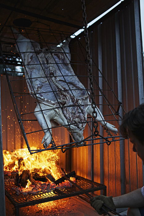
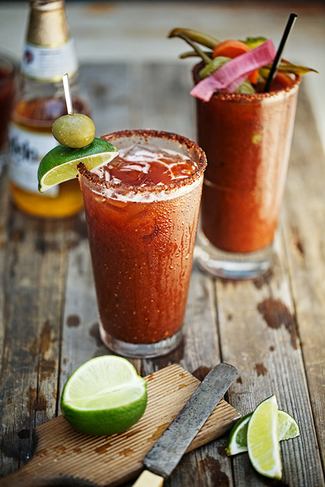
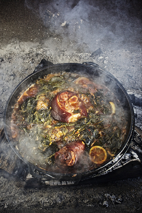
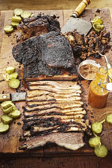
Through networking and coincidence, photographer Jody Horton landed a gig for a heroic new cookbook Smoke: New Firewood Cookingby celebrated chef Tim Byres. Jody first met Tim at a Southern Food Alliancemeeting. Years later,Jody was dropping an assistant of his off in Dallas and realized that Tim’s restaurant “Smoke” was next door.  Acting on a whim, Jody went in to speak with Tim. This simple act would lead to a job that took the better part of a year to complete.

After some back and forth, Tim and Jody agreed that Smoke would be the perfect project for them to collaborate on.  Once hegained approval from book publisher Rizzoli, Jody was hired for the job.

The principle recipe photographs were created over a three week period, but Jody continuedto photograph various “feasts” prepared by Tim for thefollowing several months - including aFood & Wine pig roast in Austin, and a beef rib BBQ in Oxford, MS.  In addition to creating a beautiful cookbook, camaraderie developed between the chef and the photographer:  “Tim and I really became friends during this process. It was one of the most rewarding parts of the project,” says Horton. “We worked hard and glory was obtained.”  

Food stylists Johanna Lowe and Kate LeSueur were central to the production, as was Tim’s assistant Brandy Spencer, who kept everyone on task.  By the end of a year, Jody and his team haddeliveredover two hundred final images for Smoke, The book has received widespread praise since its release last year and was recently nominated for a prestigious James Beard Award!

Jody is currently shooting his tenth cookbook, and has no plans to slow down: “I love longer-form projects. They are a great balance to typical jobs that only last a day or so.”

To see more of Jody’s hunger-inducing imagery, head to his FoundFolios portfolio.

Matt Sartain Drinks It In San Francisco-based conceptual...

$
0
0


Matt Sartain Drinks It In

San Francisco-based conceptual photographer Matt Sartain recently landed a gig shooting for Kendall-Jackson wine.  After working with Matt on a previous job, the creative director for the agency in charge of the ad campaign knew that Matt’s style would lend itself beautifully to the look and feel that they wanted.  A brief phone call later and Matt was hired for the job.  “It was great to have someone know my vision and my style, and come straight to me with a project,” said Matt. “Mark (the CD on the project) knew that this was my wheelhouse.”

The ad agency had a pretty clear vision for what they wanted to show, and they presented Matt with four comps of people juxtaposed with comically large bottles of Kendall-Jackson wine.  Matt knew that this was in line with his quirky style and would have no problem knocking this job out of the park.  The biggest challenge from Matt’s perspective was scheduling and coordinating everything so that it could be shot in a single day.

The backdrops of the advertisements were drawn from Matt’s large library of pre-existing backgrounds which he had shot in various locations.  For the actual assignment shoot, Matt scouted out parks around the Bay Area until he found the ideal locales for his photos.  Having everything meticulously pre planned made things easier on Matt and his team when the day of the shoot came.  “It was definitely a challenge coordinating everything, but we pulled it off and the client loved it,” recalled Matt.

Another hurdle Matt and his team faced was how to leave room in the photo for the giant wine bottles (which obviously needed to be added in post-production).  “We ended up using trash cans painted white as an inexpensive stand in,” Matt said, “which worked out great.”

To see more of Matt’s whimsical work, visit his FoundFolios portfolio.

Sue Barr’s Conception The concept of the American nuclear family...

$
0
0


Sue Barr’s Conception

The concept of the American nuclear family has come a long way in the past sixty years.  Nowadays it seems that the average domestic unit is more Modern Family than Leave it to Beaver.  Picking up on the radically accelerating acceptance of non-traditional couplings, photographer Sue Barr decided to launch a deeply personal project entitled “Conception.”

“Conception” is an attempt to showcase atypical families with beautiful, fine art portraits.  Primarily a lifestyle photographer, Sue is viewing this project as a means to hone her fine art skills and experiment with new techniques.  More importantly, however, Sue wants to shed light on the fact that “a family is simply about sharing love and nurturing.”  She had been interested in alternative family units (such as same-sex, interracial, adoptive, or single parent households) since before she was even a mother herself.  The birth of her son only strengthened her passion for this idea.  Out of this passion, “Conception” was born.

Sue is excited to continue the project, having had the pleasure to meet all types of families, all equally healthy and loving.  There was the lesbian couple in Chicago with an adopted African daughter.  Then, there was the single male head of a prestigious New York school who is expecting twins through an egg donor and a surrogate.  “I have been lucky enough to meet all sorts of families,” said Sue “I want to be able to photograph and chronicle some of the more unique as well as the ordinary non-traditional families to make sure that future generations know that gender, religion, race or whatever stigma can never get in the way of nurture.

Click here to read more and help fund Sue’s critically important and artistic project.

Click here to see more of Sue’s work on her FoundFolios portfolio.


Robb Scharetg Scouts It Out When Robb Scharetg gets an...

$
0
0


Robb Scharetg Scouts It Out

When Robb Scharetg gets an assignment, he takes no shortcuts.  Such was the case with a recent shoot Robb was commissioned to do for Victor Stanley furniture. 

Robb received a phone call from a Creative Director he had worked with on a project seven years prior.  The CD had a job come across his desk that he knew Robb would be perfect for.  The gig required shooting three ads in one day, no small feat as-is.  Complicating things was the fact that the agency was requiring very specific types of locations for the ads. 

“I didn’t feel comfortable having anyone scout these locations except for me,” recalled Robb.  So, the intrepid photographer got in his car and covered over 900 miles of the eastern seaboard looking for the perfect location.  Eventually Robb settled on Washington, DC for ease of travel and idyllic shooting locations.  Once he found his location, Robb knew that he would be able to deliver exactly what the agency needed.

“The scouting was definitely the hardest part,” Robb commented. “The talent was great and very easy to work with, and the client was thrilled with the end product.”  The final images ran online on the Victor Stanley website, as well as in various publications marketed to landscape architects.  The best news?  The dealer actually reported that sales were up after the advertising began to run!

To see more of Robb’s imagery, head to his FoundFolios portfolio.

Like Clockwork, with Thomas Kuoh It’s not every day you...

$
0
0


Like Clockwork, with Thomas Kuoh

It’s not every day you get a call from the founder and CEO of a worldwide watch company. Fortunately for photographer Thomas Kuoh, this was one such day. Barry Cohen, of Luminox Watches and Bodyglove Watches, reached out to Thomas to shoot a new brand that Cohen was starting. Called Szanto Watches, the company produces a line of affordable vintage looking watches reminiscent of a bygone era and a wartime aviation feel. 

Thomas felt an instant connection with the project, due to their shared aesthetic. As details of the assignment were decided on, Thomas felt more and more inspired. With a small, start-up budget, Szanto gave Thomas the creative reins, letting him play creative director, producer, and photographer. “This kind of trust and power was incredible,” Thomas recalls, “I was able to make the decisions I thought best fit the brand and in return, Szanto said ‘We trust you.’” In the end, Thomas teamed up with stylist, Heather Sansky, a long time friend who he was able to collaborate with at a very high level. Her aesthetic and experience styling for 5.11 Tactical wear made her a perfect fit.

"The shoot took place at the Oakland Aviation Museum, which was a ton of fun. The staff was incredibly accommodating, and taught us things about the vintage World War II aircraft we shot in! They even let us get inside the cockpits of real WWII planes and helicopters, and showed us around modified bombers turned cruisers." Thomas and Heather, alongside a pair of photo assistants, were able to knock out the shooting in only two days, much to the delight of Barry Cohen & Szanto.

"I’m really quite pleased with how these shots turned out," says Thomas, "The way everything fell into place so perfectly really makes this one of the more memorable shoots."

To see more of Thomas’ work, head to his FoundFolios portfolio.

A Winter Storm is Snow Problem for Eric Prine Photographer Eric...

$
0
0


A Winter Storm is Snow Problem for Eric Prine

Photographer Eric Prine was recently tapped to do a shoot for Subaru America and AdAsia.  Having previously done a gig for this client, he had developed a great working relationship with them.  Subaru liked his initial project so much that they invited him back to do a shoot centered around the Chinese Lunar New Year, the Year of the Horse.  “They were just fantastic people to work with, so I was happy they called me back,” recalled Eric.

The original concept involved a young couple seeing their daughter as she finished up with her riding lesson, and it was to be set in a large open green field. Eric traveled to New York from Chicago and assembled his team. Unfortunately, after he arrived, it being December, an unexpected snow storm was about to hit the northeast. They called it Winter Storm Electra. Electra was forecasted to dump several inches of snow, and the image could not have any snow in it.  In fact, it was not meant to look like winter at all!

For several days Eric, his producer, his agent, and the ad agency were all looking for solutions. He spent a day driving several hours north hoping to find a location where the snow had missed, but it was no use. The snow was falling and we were one day away from shooting. At the last minute, the night before, the shoot was postponed. It was put off for two days while they came up with a solution.

The concept was reworked to be located near a stable or barn, thus eliminating the field and trees that would be snow-covered. “However,” remembered Eric, “We still had the foreground and the barn itself to deal with. Luckily, the day after the snow fell, the sun came out and the snow on the barn roof was mostly gone, only leaving a small amount to retouch out. But there was no way that the snow would all melt from the ground.”  Eric and his team came up with a very simple and labor intensive solution in two parts: Part one was all hands on deck shoveling snow and getting it out of the shot. Part two was to bring in more than 400 pounds of top soil and cover the foreground. “400 pounds did not cover as much as I would have liked, so that still left a lot of retouching to extend that amount of soil to fill the entire foreground.

With the help of a fantastic crew, a little hard work, and some time spent in post-production, the final product came out even better than Eric had hoped. And the client was extremely happy too. “I can’t wait for the next round,” commented the resolute photographer.

To see more of Eric’s work, visit his FoundFolios portfolio.

Kremer and Johnson Get Fried Kremer and Johnson, a commercial...

$
0
0


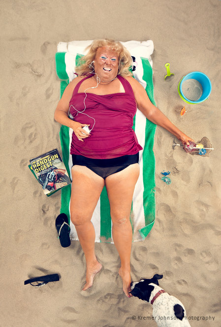
Kremer and Johnson Get Fried

Kremer and Johnson, a commercial photography duo based in Los Angeles, had been trying to expand their photographic repertoire.  “We’re looking to beef up the humor elements of our portfolio,” commented Neil Kremer, “We think that it’s absolutely commercially viable.”  With that in mind they plotted a humorous shoot called Fried based around the idea of a long day at the beach.   

After some clandestine “borrowing” of sand from a nearby beach (don’t worry they returned every grain after the shoot), Neil and Cory set about constructing the beach scene in their studio.   “Our choice to shoot this in the studio instead of on location was based on control and budget.  In the studio we had complete control of the light quality and the wind.  The dog was also easier to manage.  We wanted to get everything in camera and that wouldn’t be possible at the beach as no dogs are allowed.  The added expense of permitting and not getting sand in our gear also made shooting in studio an easy decision,” remember Neil.

Getting the lighting right was crucial, so Neil and Cory took pains to set up the lights one at a time to really achieve the beach feeling.  The duo then called on long-time collaborator Good Time Laurie to be their sun-worshipping model. 

The shoot resulted in about 40 hilarious shots of a beach-goer pleasantly snoozing in the sun after a few cocktails.  The images are really helping us build up a different angle for our photography,” said Neil. “We sent the best images out in a promotional email, and quite a few agencies responded positively to it.”

Click here to see a behind the scenes video of the shoot.

To see more of Kremer and Johnson’s work, visit their FoundFolios portfolio.

Andrew Buchanan’s Award Winning Shot Congratulations to...

$
0
0


Andrew Buchanan’s Award Winning Shot

Congratulations to FoundFolios member Andrew Buchanan for taking third place in the Landscape category for the 2014 APA National Awards.

The award winning snap seen above was taken from a helicopter flying several hundred feet above the Skagit River Valley in north Washington state.  “The rivulets, channels, and pools of the mud flats resembled the surface of a brain, or something examined under a microscope slide, rather than a vast expanse of silty mud and brackish water,” comments Buchanan, who specializes in architectural, interior, landscape and aerial photography.

“This is a great example of how eye-opening, even misleading, the literal world can look when stripped to its basic, two-dimensional forms, but also of how interesting it can be to feature a pretty mundane subject in a very graphic and unusual way.

To see more of the Washington-based photograpgher’s work, visit his FoundFolios portfolio.

Viewing all 188 articles
Browse latest View live